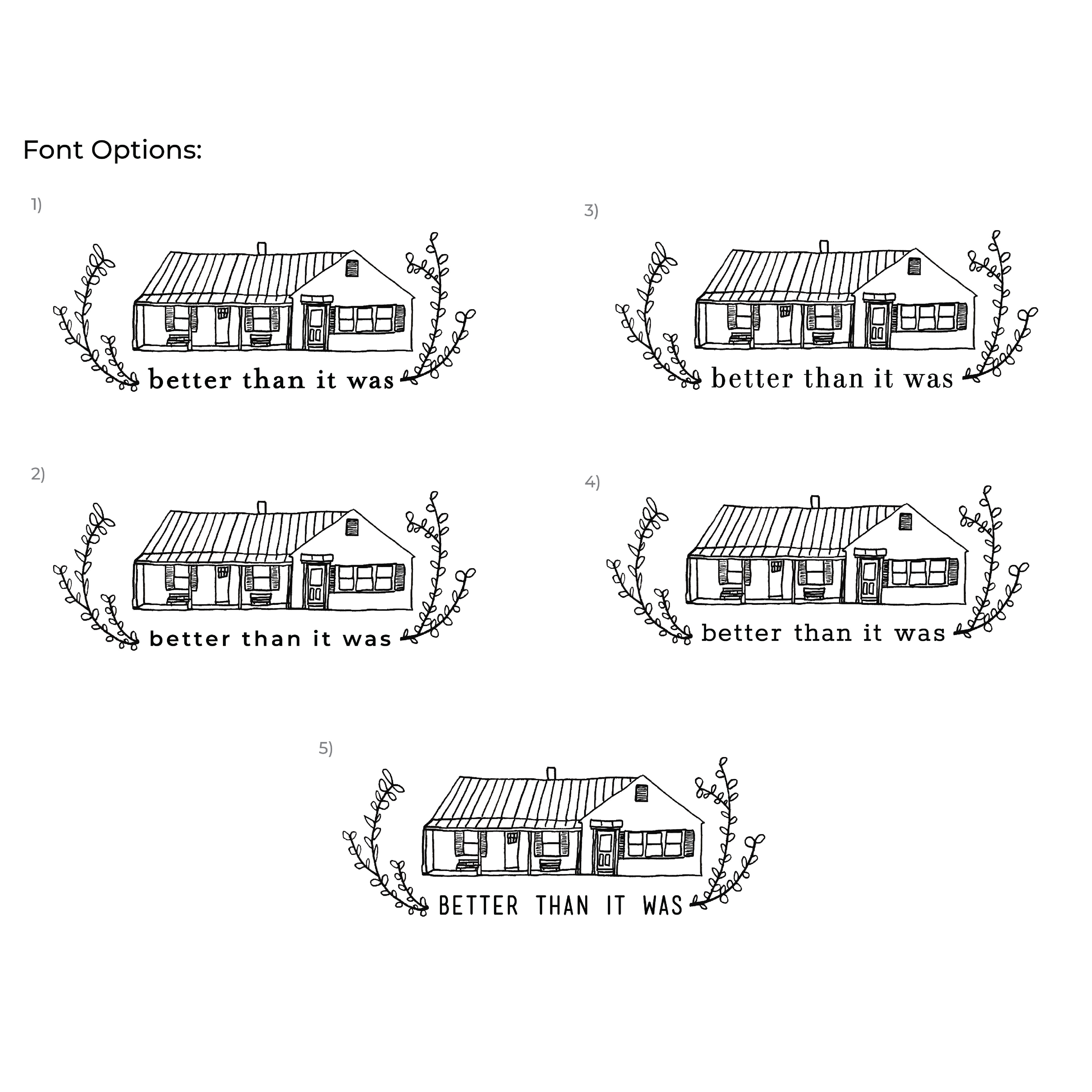
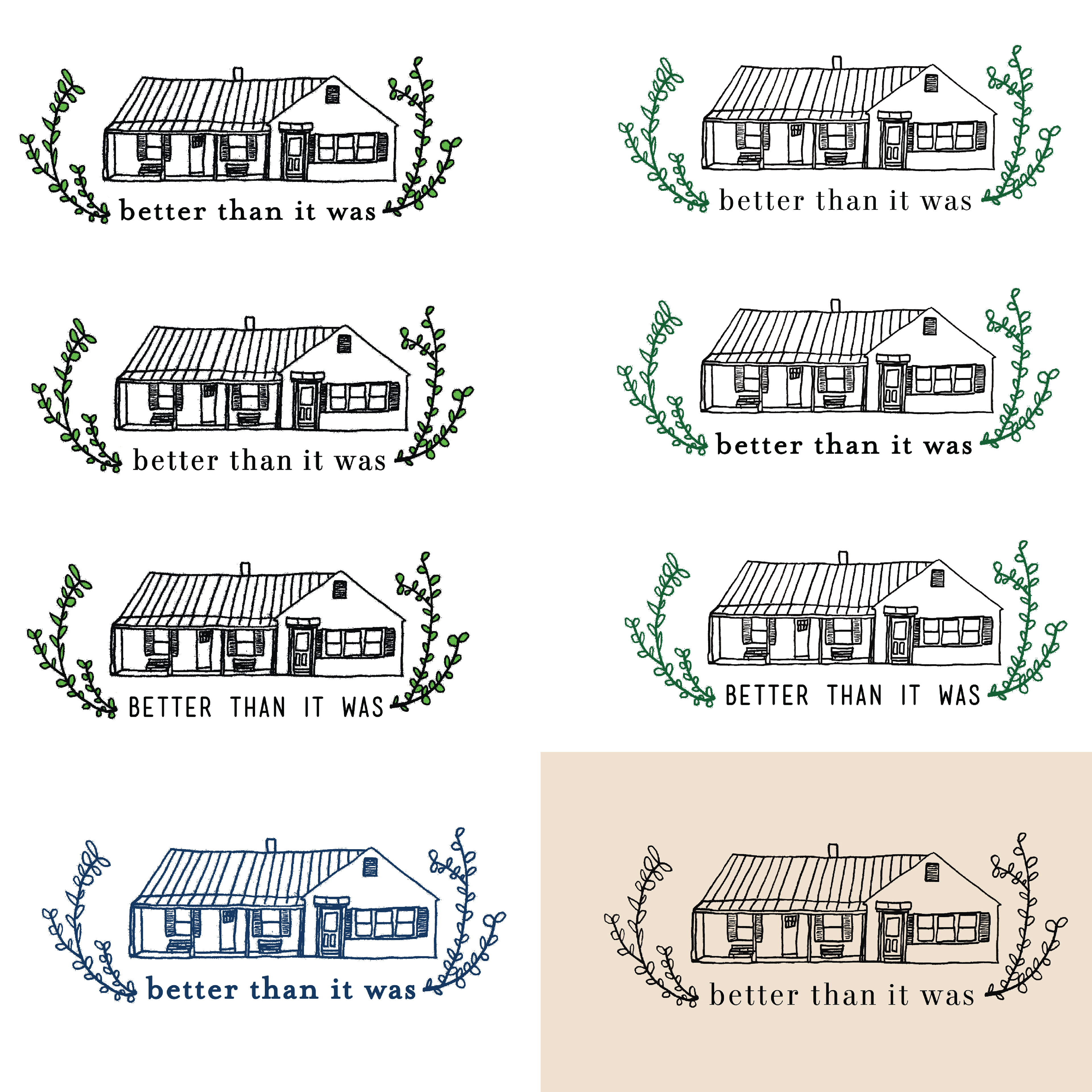
This is a logo I created for a home repair blog. They came to me wanting a logo based on their house that had a hand done feel. After some initial sketching of the house itself, we settled on a version and I began experimenting with the type, color, and other hand drawn elements (types of plants, vines, etc) to tie it all together. After a final round with various options to choose from, we settled on one and tweaked the green to be just right. I was really pleased with how this project turned out, and was so happy to be able to create just what the client was looking for.


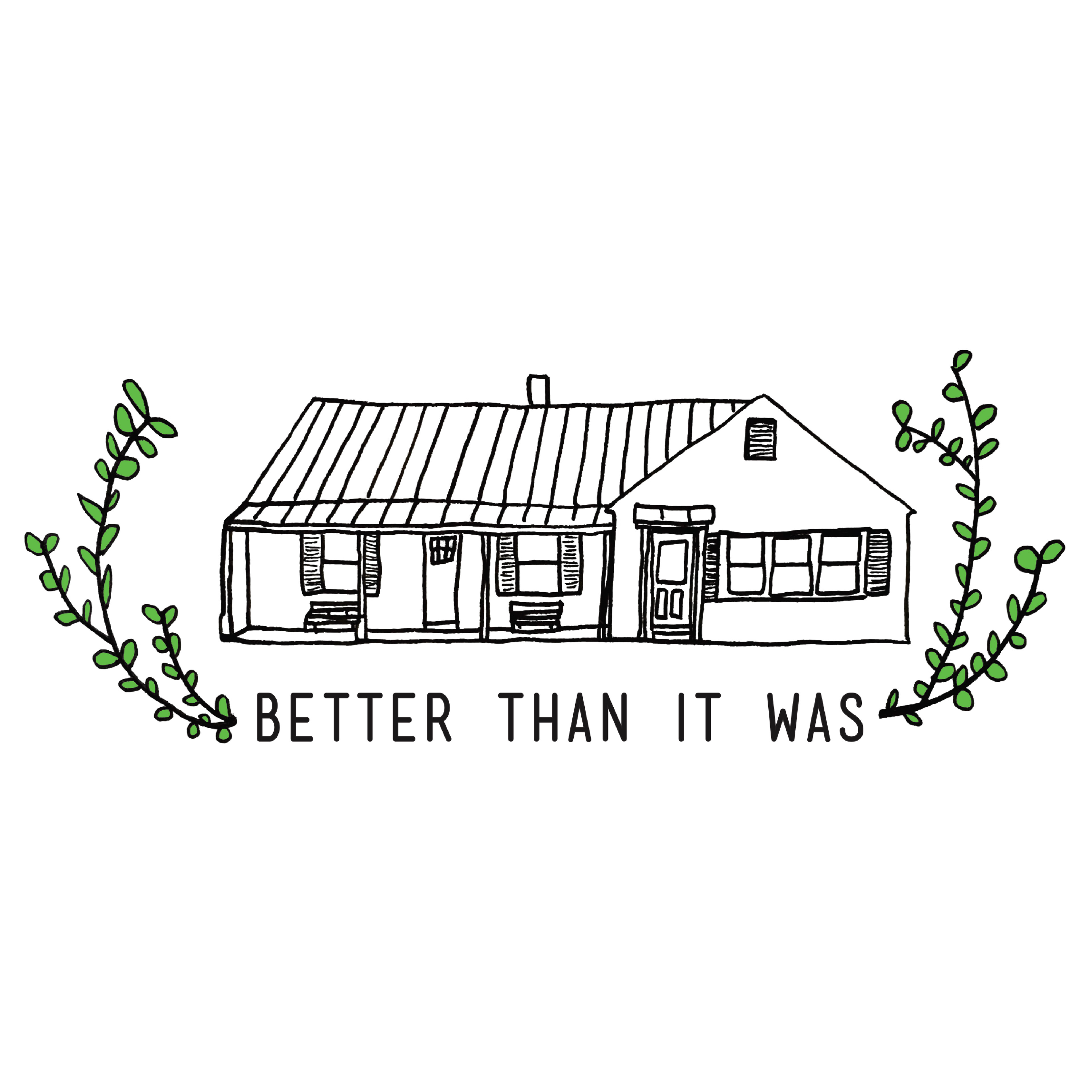
See the final logo on the blog at https://betterthanitwas.blog/